


 Sign In
 Create Account

 seriously.
 eyo to fenris, rags, and ahroun
Hi Cal am new to the forums and have recensently joined APOC.
i've seen your great singtures that you have made and i was wondering if you could make me one
jez
Choose a background
Toggle shoutbox
TR Shoutbox

|
|||||||||||||||||||||||||||||||||||||||||||||||||||||||||||||||||||||||||||||||||

Caledonia´s signature portfolio
Started by Caledonia, Nov 29 2008 10:05 AM
65 replies to this topic

 Back to top
#2

 Posted 20 September 2009 - 10:51 AM
Caledonia
-
- Members
-

- 596 posts
Alien Organism
- Gender:Male
- Location:playing WoT @caledonia069


#3
Posted 20 September 2009 - 01:36 PM
Creepingdeath
-

- Members
-
- 122 posts
frozen Sushi
- Gender:Male

#4
Posted 21 September 2009 - 07:57 AM
jez
-

- Members
-
- 23 posts
cloned Sheep
#5
Posted 21 September 2009 - 08:03 AM
Ragman
-

- Root Admin
-
- 1,499 posts
Too old to care.
- Gender:Male
- Location:Leyland, UK
#6
Posted 09 January 2010 - 06:30 AM
Caledonia
-
- Members
-
- 596 posts
Alien Organism
- Gender:Male
- Location:playing WoT @caledonia069
moved this post from Scorpions topic to here for editing reasons
"well i tried one for the unreal,mass effect and doom? theme so far,hope its not that bad.lol


as i am working with photoshop i save them in the psd format.so if anything needs changing it can be done bit by bit without starting from scratch. "
"well i tried one for the unreal,mass effect and doom? theme so far,hope its not that bad.lol
as i am working with photoshop i save them in the psd format.so if anything needs changing it can be done bit by bit without starting from scratch. "
...stand by your brother, die for the clan...

#7
Posted 10 January 2010 - 06:42 AM
Caledonia
-
- Members
-
- 596 posts
Alien Organism
- Gender:Male
- Location:playing WoT @caledonia069
here are another set of signatures. some i did recently, others i did awhile back. see what you think.
they weren?t ordered. i only posted them here to see what they would look like when on the forum.
Caledonia


they weren?t ordered. i only posted them here to see what they would look like when on the forum.
Caledonia
...stand by your brother, die for the clan...
#8
Posted 10 January 2010 - 07:51 PM
Black Scorpion
-

- Members
-
- 1,286 posts
Retired from TT
- Gender:Male
- Location:Planet Crete, Omicron Gamma
Good stuff buddy, I can see you have been practicing and made a lot of progress! My favorites in your last post are Ace Rimmer's and Fen's. The way you set up the color balance in Ace's is really nicely done I think, and I really like the partial border that overlaps in the bottom left corner in Fen's sig, as well the large transparent area. And the colors fit each other well in that one too.
If you don't mind me giving you one little tip though: most of your sigs that have shadows near the outer borders, have the shadows cut off at the sig outer edges. Fen's sig is a good example of that. This is hard to see when you are working on it, but it always shows when the sig is posted. You can prevent this by making sure that the borders of the shadow layers do not cross the final outer borders of the sig (the 500x150). I personally always apply the shadows on a new 100% transparent border, and make sure this layer is 500x150 px or smaller before I introduce the shadows.
What I find very helpful too, is having one (or sometimes 3) background layer(s) in white, black and/or grey (the forum background color). While working on the sig I click these layers on and off, to see if there might be some residual pixels from a render floating around, and everything is where it should be.
By the way, I love the font on Qjake's sig. (the one you used for his name) Any chance you wanna tell me what the name of that font is?
Keep up the good work buddy!
Retired.
"Never argue with an idiot, you will have to lower yourself to their standard and they will beat you with experience"
"Never argue with an idiot, you will have to lower yourself to their standard and they will beat you with experience"
#9
Posted 23 January 2010 - 06:26 PM
Caledonia
-
- Members
-
- 596 posts
Alien Organism
- Gender:Male
- Location:playing WoT @caledonia069


#10
Posted 23 January 2010 - 08:51 PM
Bogd@n
-

- Members
-
- 204 posts
Admin Meat!
- Gender:Male
- Location:Romania: Curtea de Arges
#11
Posted 13 May 2010 - 11:03 AM
Caledonia
-
- Members
-
- 596 posts
Alien Organism
- Gender:Male
- Location:playing WoT @caledonia069
well, it looks like some of the new guys around were looking for some signatures. was able to make one so far, hope you like it.
****deleted image****
Caledonia
****deleted image****
Caledonia
...stand by your brother, die for the clan...
#12
Posted 13 May 2010 - 07:04 PM
WildSurfer
-

- Members
-
- 116 posts
frozen Sushi
- Gender:Male
- Interests:Worlwide cooking - Bowling - Cinema - Freelancer and TT - PC and Nintendo Games.
well, it looks like some of the new guys around were looking for some signatures. was able to make one so far, hope you like it.
Caledonia
Caledonia,
I can't find the words to tell how i like, is it possible for you when you get some time, to have a look to the
newest ones sig I'd like some like this, if possible. Please let me know if it is possible, I am ready to put credits
for your work, your above sigs are just marvelous, and I think this word is not strong enough. Ah my comrad
The Contractor is fully impressed and stayed without voice, starving to have his own.
Meanwhile i send you my best regards.
Wildsurfer

Good flight and long life to DD
#13
Posted 13 May 2010 - 07:24 PM
Black Scorpion
-
- Members
-
- 1,286 posts
Retired from TT
- Gender:Male
- Location:Planet Crete, Omicron Gamma
Nice work again Cale m8, totally 'Cale-style'. Nice one. 
Retired.
"Never argue with an idiot, you will have to lower yourself to their standard and they will beat you with experience"
"Never argue with an idiot, you will have to lower yourself to their standard and they will beat you with experience"
#14
Posted 13 May 2010 - 07:32 PM
Caledonia
-
- Members
-
- 596 posts
Alien Organism
- Gender:Male
- Location:playing WoT @caledonia069
right, heres the second one. this is starting to look like a marvel comics convention. lol.
****deleted****
Caledonia
****deleted****
Caledonia
...stand by your brother, die for the clan...
#15
Posted 13 May 2010 - 08:00 PM
nobodie
-

- Members
-
- 587 posts
Alien Organism
- Gender:Male
- Location:Omicron Gamma
- Interests:World Domination
Nice work Caledonia, but! Dont know how to explain, when i look at Contractors sig you made my eyes stick to only one spot, kind of ignoring overall view because that spot in my view is critical.
It is where black guys skull crosses the border of the sig. It just screams MAGNIFY ME and see if the head is cut a bit or i ends up just right there (in the last case, its really bad).
May I suggest either make the guy little bigger so head "cut" would be more obvious/use transparancy to make head go over the border, or make him the way his head does not reach the border.
(Could be just me though...)

#16
Posted 13 May 2010 - 08:05 PM
Caledonia
-
- Members
-
- 596 posts
Alien Organism
- Gender:Male
- Location:playing WoT @caledonia069
problem is, his head is really cut off at that point. and it was just a draft to see how the signature would look on the forum. here is the original picture for comparison.Nice work Caledonia, but! Dont know how to explain, when i look at Contractors sig you made my eyes stick to only one spot, kind of ignoring overall view because that spot in my view is critical.
It is where black guys skull crosses the border of the sig. It just screams MAGNIFY ME and see if the head is cut a bit or i ends up just right there (in the last case, its really bad).
May I suggest either make the guy little bigger so head "cut" would be more obvious/use transparancy to make head go over the border, or make him the way his head does not reach the border.
(Could be just me though...)
http://www.stoppschi...ingpin-1280.jpg
...stand by your brother, die for the clan...
#17
Posted 14 May 2010 - 11:03 AM
Caledonia
-
- Members
-
- 596 posts
Alien Organism
- Gender:Male
- Location:playing WoT @caledonia069
well i had another go at a signature for you,m8. somehow i couldnt get myself to like the colorscheme of your current signature,m8. i´m sorry. instead i made this one. i hope you like it nonetheless.
****deleted image****
****deleted image****
...stand by your brother, die for the clan...
#18
Posted 14 May 2010 - 11:17 AM
WildSurfer
-
- Members
-
- 116 posts
frozen Sushi
- Gender:Male
- Interests:Worlwide cooking - Bowling - Cinema - Freelancer and TT - PC and Nintendo Games.
[quote name='Caledonia' post='2077970' date='May 14 2010, 03:03 PM']well i had another go at a signature for you,m8. somehow i couldnt get myself to like the colorscheme of your current signature,m8. i´m sorry. instead i made this one. i hope you like it nonetheless.
Cale,
I can't wait to see you, I have only to stand up and applause, this sig is absolutely what I expected,
a pure wonder. I show it to my comrad and he agrees with me, this sig is made for me. Whatever you may
ask me, be sure I'll always be there.
Wildsurfer
Cale,
I can't wait to see you, I have only to stand up and applause, this sig is absolutely what I expected,
a pure wonder. I show it to my comrad and he agrees with me, this sig is made for me. Whatever you may
ask me, be sure I'll always be there.
Wildsurfer
Good flight and long life to DD
#19
Posted 17 July 2010 - 08:05 AM
Caledonia
-
- Members
-
- 596 posts
Alien Organism
- Gender:Male
- Location:playing WoT @caledonia069
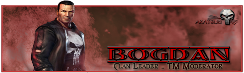
heres another requested signature. i hope it tickels your fancy....
Caledonia

Caledonia
...stand by your brother, die for the clan...
#20
Posted 17 July 2010 - 08:22 AM
Bogd@n
-
- Members
-
- 204 posts
Admin Meat!
- Gender:Male
- Location:Romania: Curtea de Arges


6 user(s) are reading this topic
0 members, 6 guests, 0 anonymous users


